Billboard advertising is good, until it is “Badvertising”
 Print
Print Email
EmailSmall business owners can effectively use billboards to build brands and increase revenue with a simple design formula.
I am a big fan of outdoor billboard advertising: you cannot avoid it, you cannot turn it off, you cannot change the channel and you cannot mute it. However, you certainly can design it to become ineffective, unless you follow a few simple rules laid out by a Michigan State University Extension educator.
Before I get into the simple rules, let me highlight a couple of billboards.
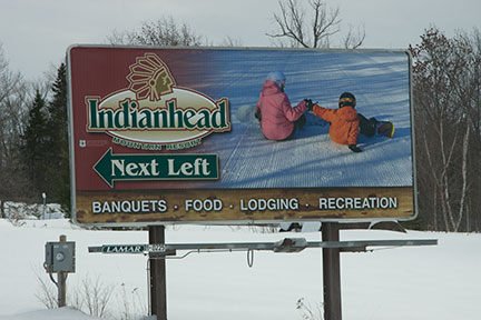
Photo: Well-designed, easy-to-read billboard, effectively communicating with a strong, emotional photo and a logo as a brand element.
The billboard above is very well-designed. It contains the first rule of mine, which is to have a strong, emotionally-laden photographic image. This board is very easy to read, it communicates the product offering, has limited data to process and has a simple graphic to let you know where to turn. Traveling at 70 mph, one could easily process the entire message in less than one second. Very well done.
Here is another outdoor billboard example:
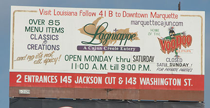
Photo: This billboard has too much information on it. Communication this dense is better suited for a website.
The billboard above violates my rule of scarcity. When traveling at 70 mph, one has a mere second to process information contained on a billboard. This billboard is so cluttered that even on the screen that you reading it, it takes many minutes to process this data—and you are only inches from the screen. This billboard is 30 feet in the air, and fifty feet off the side of the road.
Here is another example of a billboard:

Photo: Even well designed billboards are subject to environmental factors.
The billboard above may have satisfied all my rules for effective billboard advertisements; however, the placement of the billboard is in question. When purchasing a billboard(s), you should drive by the location(s) for yourself. Most billboard companies are very good at maintaining their boards with routine maintenance, repairs after storms and brush removal. But, as you can see, some billboards need a little more maintenance than others.
Here is a billboard that violates my rule of font size and clutter.
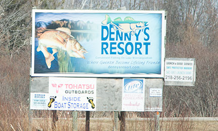
Photo: This billboard has a nice graphic and a strong logo, but one cannot read the copy.
Billboards should be designed using large sans-serif fonts. Big and bold is what I tell my clients. At 70 mph, one cannot process the small type, and in the example above, cannot even read what it says. The other issue with this billboard is the intentionally-introduced clutter surrounding the billboard. There are simply too many things to look at on this piece of marketing communications.
Billboards are typically placed next to a busy road, and where I live, the busy roads are highways with speeds up to 70 mph. Regardless of where your billboard is placed, here are few simple rules to guide your next billboard project.
Four simple rules for effective billboard advertising:
- Use an emotionally-laden photo to connect with your audience and to draw attention to your billboard
- Use a clever, meaningful headline
- Use big and bold fonts
- Avoid clutter and limit text to just a few words
Following the simple rules above, you should have a billboard that is effective in your advertising campaign.